Posts

Showing posts with the label Planning

Magazine Cover Second Draft

Image
Audience Feedback 'The white line at the bottom is over lapping with the bar code with a noticeable line' 'Maybe make the picture bigger again, there's still a lot of blank space' 'The masthead could still be taller, just to stand out more' 'I like the sell lines, they frame the image well.' 'On the image there is a line from where the image was smaller and you reduced the opacity of the cloud effect, maybe get rid of it again on the image.'

Picture for Magazine Cover

Image

Image Planning/Shots Taken Magazine Cover

Image
For my magazine cover I am going to use two images that I will blend onto each other to create one image. The use of the picture again is keeping consistency across my products as well as making the image clear to the audience. For this unlike my poster , however, this image wont have reference to the protagonist as normally on magazine covers horror films will put the antagonist on the cover.

Magazine Rough Draft

Image
Feedback from audience: 'The Masthead could be taller and stand out more' 'Get rid of  the The Picture bit in the sell line above the big title of the movie, it doesn't need to be there twice.' 'Make the font on the Interview with the director smaller so that its more like the top 10 movies sell line' 'Maybe make the image larger to fill more space, there is a lot of blank space' 'I like the cloud effect in the background, makes it more interesting.' 'The line at the bottom is too eye catching and big, maybe make it smaller?' 'The Issue number needs to be smaller, it's too big' 'I like the image, especially the eyes as it makes it more creepy'

Magazine Layout

Image

Magazine Pitch and Definition of Audience

My magazine will be called The Ghoulish and it will be sold at supermarket stores for £2.99. The magazine itself will be less serious that my other two products in order to be more shelf friendly. The magazine will contain and article on our film as well as articles for other horror/horror sub-genre films put this year. My audience will be similar to my trailers audience in that it will be aimed at males aged 16-25 who are interested in horror. The only different here being that there will be less of a focus on being a creative and more a focus on the horror genre as a whole.

Magazine Analysis

Image

Poster Second Draft

Image
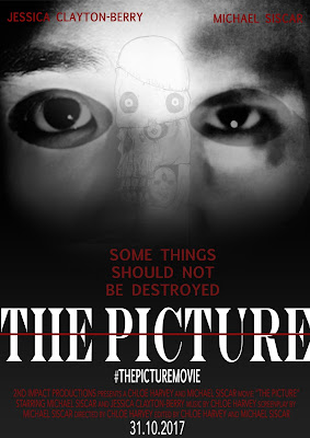
For the second draft of my poster I have created two versions based on audience feedback. One (left) has had the image of the actual picture added onto it in order to relate it more to the film. This may not be a great addition as it is starting to take away the simplicity the poster had before. This poster also has amendments to the cast lines colour and font as well as position and small sizes have been made to the fonts on "THE PICTURE" and "SOME THINGS SHOULD NOT BE DESTROYED" in order to make the title stand out more. The second poster (right) is without the addition to the image but does have the same alterations to the cast lines and the fonts on the title and subtitle. This poster is more simplistic and not as busy which may be a positive rather than having another imaged layered on top as the focal centre of the poster is easier for the audience to see. I require more feedback for both posters in order to determine the best one f...

Poster Feedback

Image
Feedback from the first draft of my poster from my target audience.

Film Poster Rough Draft

Image

Image Planning/Shots Taken Poster

Image
These are the images I will be using for my Poster. What I plan to do is to blend all three into one by using the mask as a foundation and the eyes of the two other pictures to go in each eye hole of the mask to show the two side of the character. I will also use the actual picture from the trailer to add on top in order to tie in the name of the film and make what it is about more clear.

Poster Layout

Image

Poster Analysis

Image

Horror Trailer Second Draft

Image

Feedback on trailer progress from target audience

Image

Rough Draft of Trailer

Image

Location Shots

Image
Danesholme Road Bus Stop This location is dark and would fit into the aesthetic of our trailer. Shots here could be used in fast paced sequences to add more tension Art Room CBA This location is good for shots of the protagonist drawing, the setting shows art and reinforces the age of the character. The lighting is bright and effective. Art Storeroom CBA This location has slightly worse lighting as there is no natural light in the room which gives the image a yellowed effect. If tempered properly in editing then it could be very effective. The cramped nature of the room will help create tension.

Risk Assessment

Image

Storyboard

Shooting Script

Image