Poster Second Draft


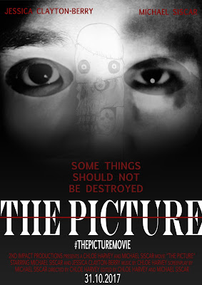
For the second draft of my poster I have created two versions based on audience feedback. One (left) has had the image of the actual picture added onto it in order to relate it more to the film. This may not be a great addition as it is starting to take away the simplicity the poster had before. This poster also has amendments to the cast lines colour and font as well as position and small sizes have been made to the fonts on "THE PICTURE" and "SOME THINGS SHOULD NOT BE DESTROYED" in order to make the title stand out more.
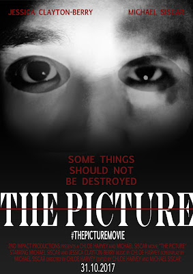
The second poster (right) is without the addition to the image but does have the same alterations to the cast lines and the fonts on the title and subtitle. This poster is more simplistic and not as busy which may be a positive rather than having another imaged layered on top as the focal centre of the poster is easier for the audience to see.
I require more feedback for both posters in order to determine the best one for my promotional package.


Comments
Post a Comment