Posts

Showing posts from February, 2017

Magazine Pitch and Definition of Audience

My magazine will be called The Ghoulish and it will be sold at supermarket stores for £2.99. The magazine itself will be less serious that my other two products in order to be more shelf friendly. The magazine will contain and article on our film as well as articles for other horror/horror sub-genre films put this year. My audience will be similar to my trailers audience in that it will be aimed at males aged 16-25 who are interested in horror. The only different here being that there will be less of a focus on being a creative and more a focus on the horror genre as a whole.

Magazine Analysis

Image

Final Poster Draft

Image

Poster Second Draft

Image
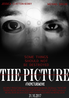
For the second draft of my poster I have created two versions based on audience feedback. One (left) has had the image of the actual picture added onto it in order to relate it more to the film. This may not be a great addition as it is starting to take away the simplicity the poster had before. This poster also has amendments to the cast lines colour and font as well as position and small sizes have been made to the fonts on "THE PICTURE" and "SOME THINGS SHOULD NOT BE DESTROYED" in order to make the title stand out more. The second poster (right) is without the addition to the image but does have the same alterations to the cast lines and the fonts on the title and subtitle. This poster is more simplistic and not as busy which may be a positive rather than having another imaged layered on top as the focal centre of the poster is easier for the audience to see. I require more feedback for both posters in order to determine the best one f

Poster Feedback

Image
Feedback from the first draft of my poster from my target audience.

Film Poster Rough Draft

Image

Image Planning/Shots Taken Poster

Image
These are the images I will be using for my Poster. What I plan to do is to blend all three into one by using the mask as a foundation and the eyes of the two other pictures to go in each eye hole of the mask to show the two side of the character. I will also use the actual picture from the trailer to add on top in order to tie in the name of the film and make what it is about more clear.

Poster Layout

Image

Poster Analysis

Image

Final Trailer The Picture

Image

Horror Trailer Second Draft

Image